Context & problem
The challenge
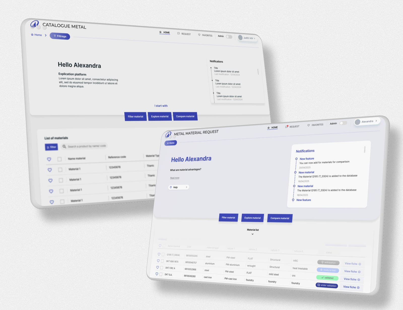
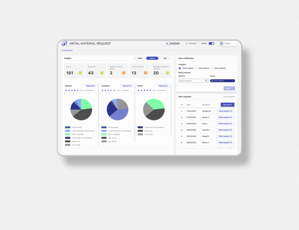
The application handled complex operational data but lacked clarity, making it difficult for users to interpret and act on information efficiently.
Key problems
- Overloaded screens with limited visual hierarchy
- Confusing navigation and filtering logic
- Inconsistent UI patterns across modules
- Not accessible for every stakeholder
💡 Reality:
Users weren’t blocked — but they were slowed down, which directly impacts operations.
Approach
We focused on simplifying how data is structured, displayed, and interacted with.olders.
Process
- UX audit of key screens and flows
- Identification of friction points in data interpretation
- Restructuring layouts and hierarchy
- Applying accessibility improvements
👉 Focus:
- Faster decision-making
- Clear data prioritisation
- Consistent interaction patterns
💡 Balance:
Working within an existing system, improvements had to integrate, not disrupt.
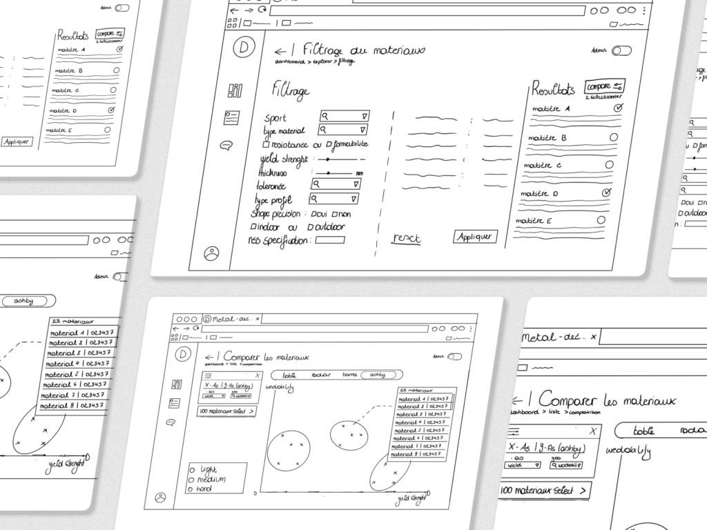
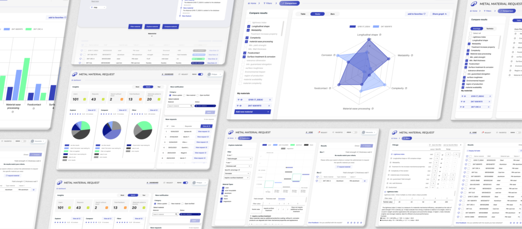
Solution
We restructured key interfaces to improve clarity, consistency, and usability.
Key improvements
- Clear visual hierarchy (grouping, spacing, prioritisation)
- Simplified filtering and navigation logic
- Consistent UI patterns across screens
- Improved flow for accessibility
Content design principles applied
- Reduce cognitive load
- Highlight what matters first
- Make interactions predictable
💡 angle:
Not redesigning features but improving how users think and act within the system..
Result / impact
Results
- Faster data interpretation and decision-making
- Reduced user friction across key workflows
- More consistent experience across modules
👉 Impact
Users can now focus on decisions instead of deciphering the interface
Reflection
In data-heavy environments, clarity is performance.
Small structural improvements can significantly impact how quickly and confidently users make decisions.
Accessibility plays a key role in making complex data usable.