Context & problem
The challenge
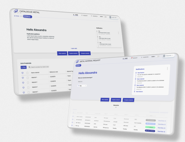
MSF’s website contained a large amount of critical information, but users struggled to navigate, scan, and understand it efficiently.
Key problems
- Overloaded pages with unclear hierarchy
- Navigation not aligned with user intent
- Inconsistent structure across pages
- Accessibility issues impacting readability and comprehension
💡 Reality:
Even when content is valuable, if users can’t find or process it, it fails its purpose.
Approach
We focused on restructuring content and flows to support both users and internal stakeholders.
Process
- Content audit & structure analysis
- Redefining information architecture
- Simplifying user flows and navigation
- Applying accessibility principles to content & layout
👉 Focus:
- Make content scannable
- Reduce cognitive load
- Align structure with real user needs
💡 Balance:
User clarity vs internal stakeholder requirements
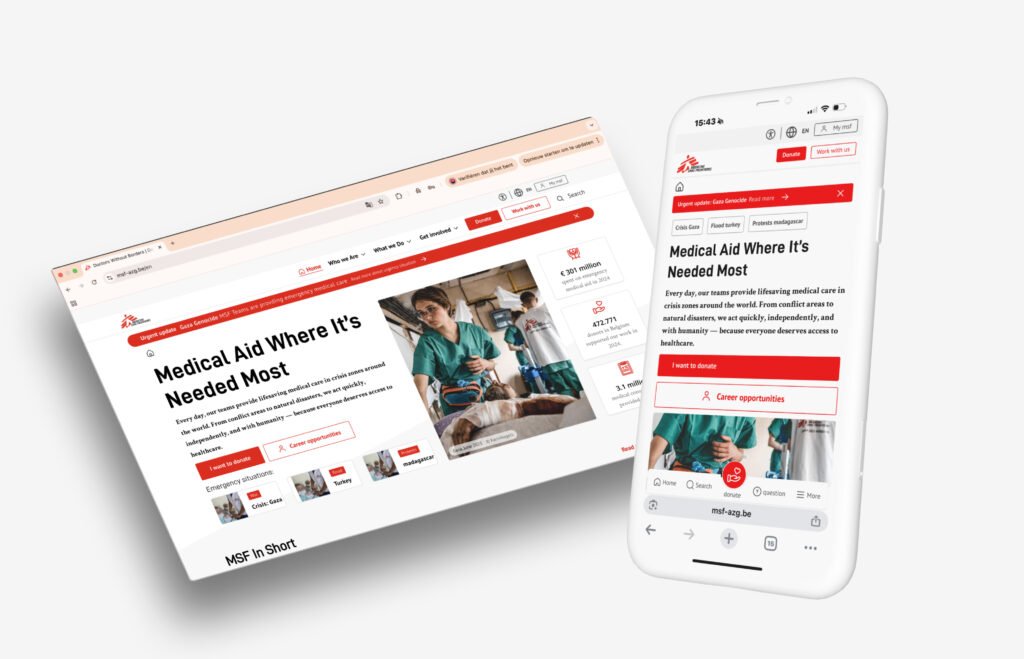
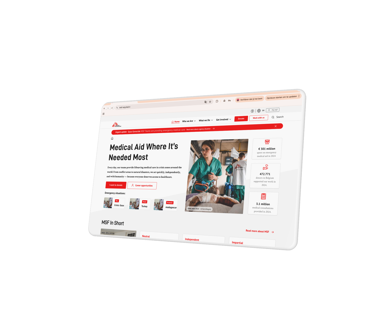
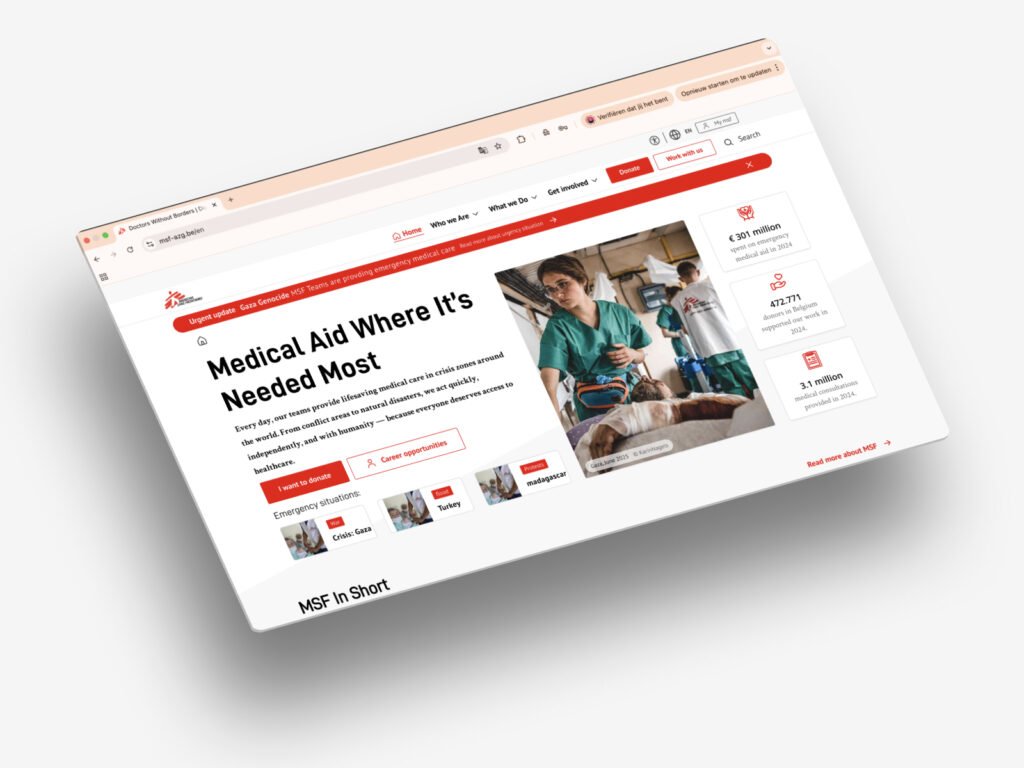
Solution
We restructured content, navigation, and layout to create a clear and accessible reading experience.
Key improvements
- Clear content hierarchy (headings, sections, spacing)
- Improved navigation aligned with user journeys
- Mobile-first readability (shorter blocks, better spacing)
- Accessible typography and contrast
Content design principles applied
- Chunking information
- Meaningful headings
- Reduced cognitive load
- Consistent structure across pages
💡 angle:
Not redesigning visuals but how information works.
Result / impact
Results
- Improved readability and content comprehension
- Clearer navigation → faster access to information
- More consistent experience across pages
- Stronger alignment between teams (content, design, dev)
👉 Impact
Information is now easier to find, scan, and understand
Reflection
Good design is not about adding — it’s about structuring. By improving how information is organised and presented, we created a better experience without increasing complexity. Accessibility played a key role in reducing cognitive load and making content usable for a wider audience.