The project context
For this project, we supported Médecins Sans Frontières in improving the structure, usability and accessibility of their website environment. The goal was not simply to “tick accessibility boxes”, but to make sure the website worked better for real users while remaining practical for internal teams to manage and build further.
That meant looking at the project from multiple angles: content flow, page structure, reusable components, accessibility requirements and the way stakeholders would eventually work with the system in practice.
🎯 The objective was clear: improve usability and accessibility in a way that is durable, scalable and realistic for the team.
The challenge
Accessibility is often approached too late in a project — after designs are made or components are already developed. In this case, the challenge was to improve accessibility while also aligning with real implementation constraints, template logic and a broader restructuring of the website experience.
The work was not limited to one page or one isolated issue. It involved reviewing how components behaved, how content would be structured across templates, and how users would move through the website with as little friction as possible.
What needed improvement
- Clearer and more consistent page structure
- Better accessibility support at component level
- Improved usability for navigation and content scanning
- More durable patterns for future page building
- Alignment between design intent, development and stakeholder use
Our role in the project
- Reviewing structure, flow and usability from an accessibility perspective
- Defining what components should meet from a WCAG point of view
- Supporting implementation reviews once templates were ready
- Helping ensure that accessibility decisions stayed practical and actionable
In other words, our role sat between strategy, UX thinking and accessibility quality control.
Our approach
We approached the project in a structured way. Rather than treating accessibility as a final QA layer, we worked through the building blocks of the website: components, templates and user journeys.
This allowed us to focus on improvements that would repeat across the system, instead of fixing isolated symptoms one by one.
Component-level accessibility work
A large part of the work focused on reusable interface components. We reviewed what each component needed to support from an accessibility perspective and translated that into clear development guidance.
- Keyboard accessibility and focus behaviour
- Heading hierarchy and semantic structure
- Link clarity and interactive states
- Support for screen reader logic
- Clarity and predictability for visual users
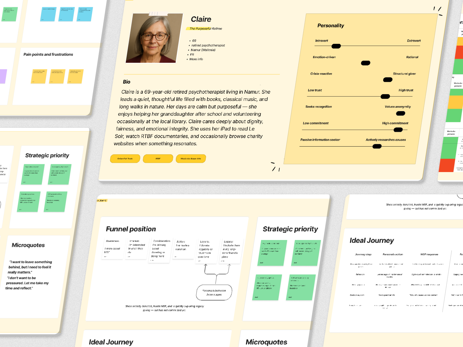
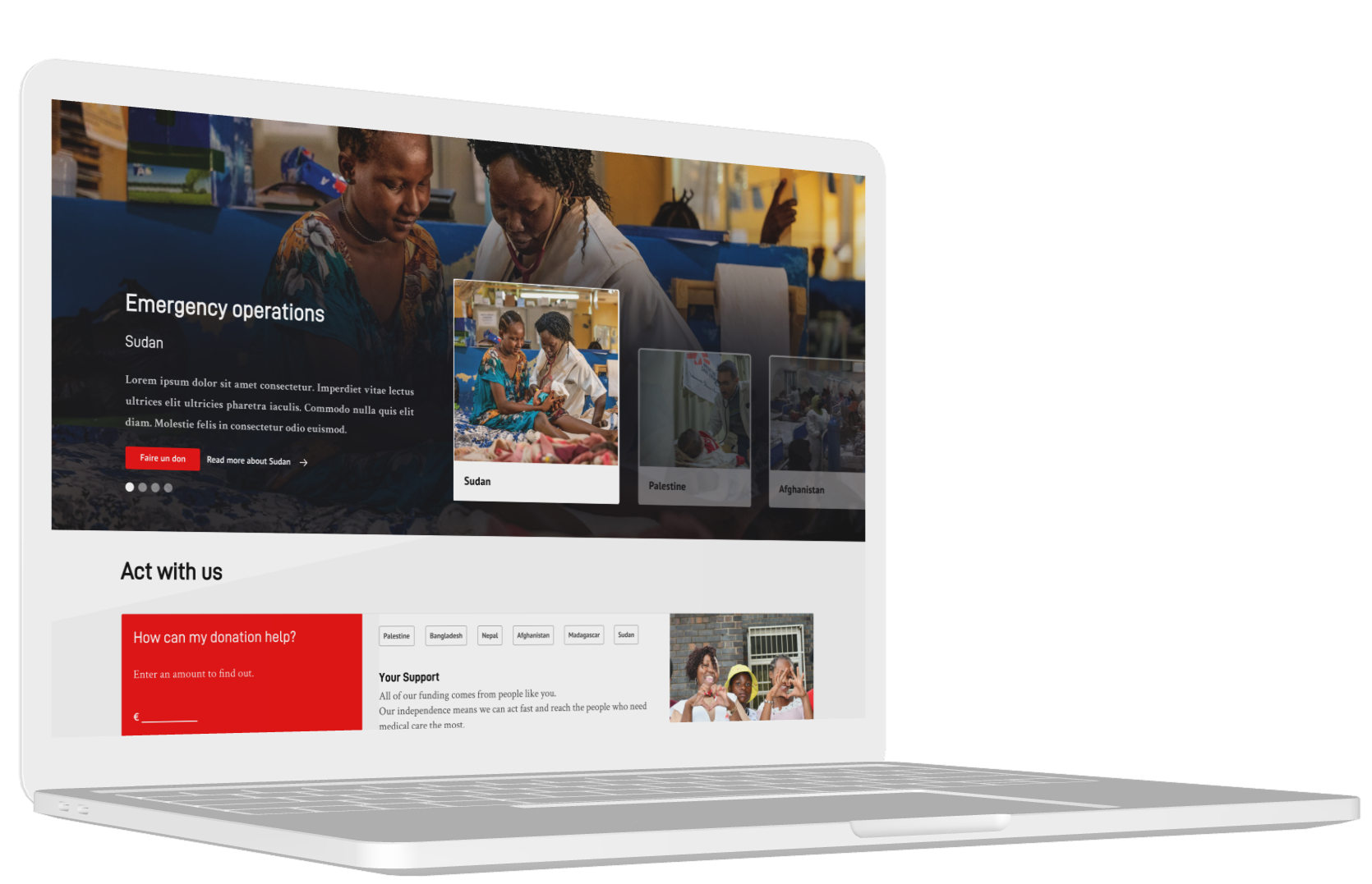
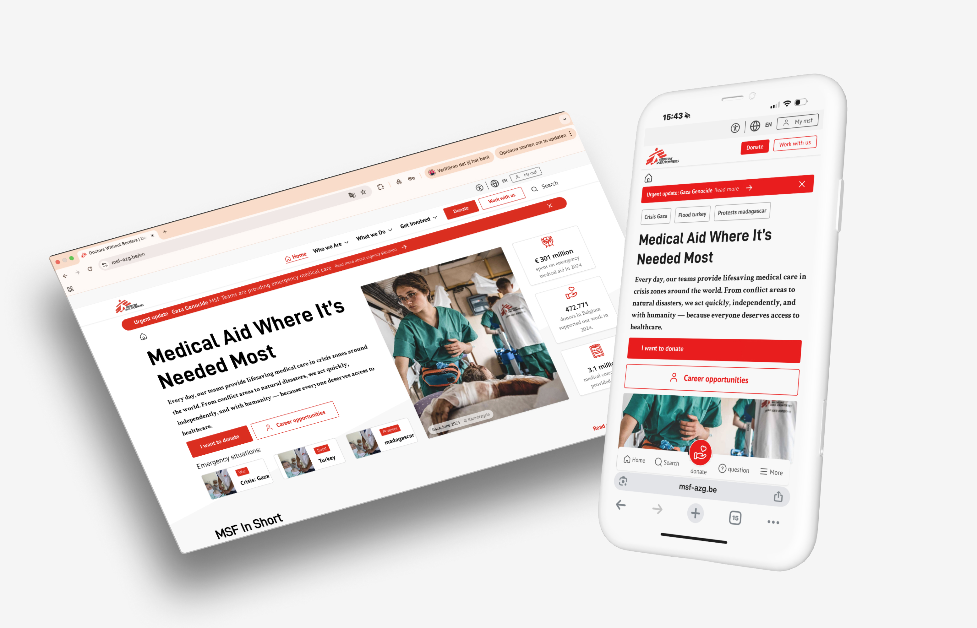
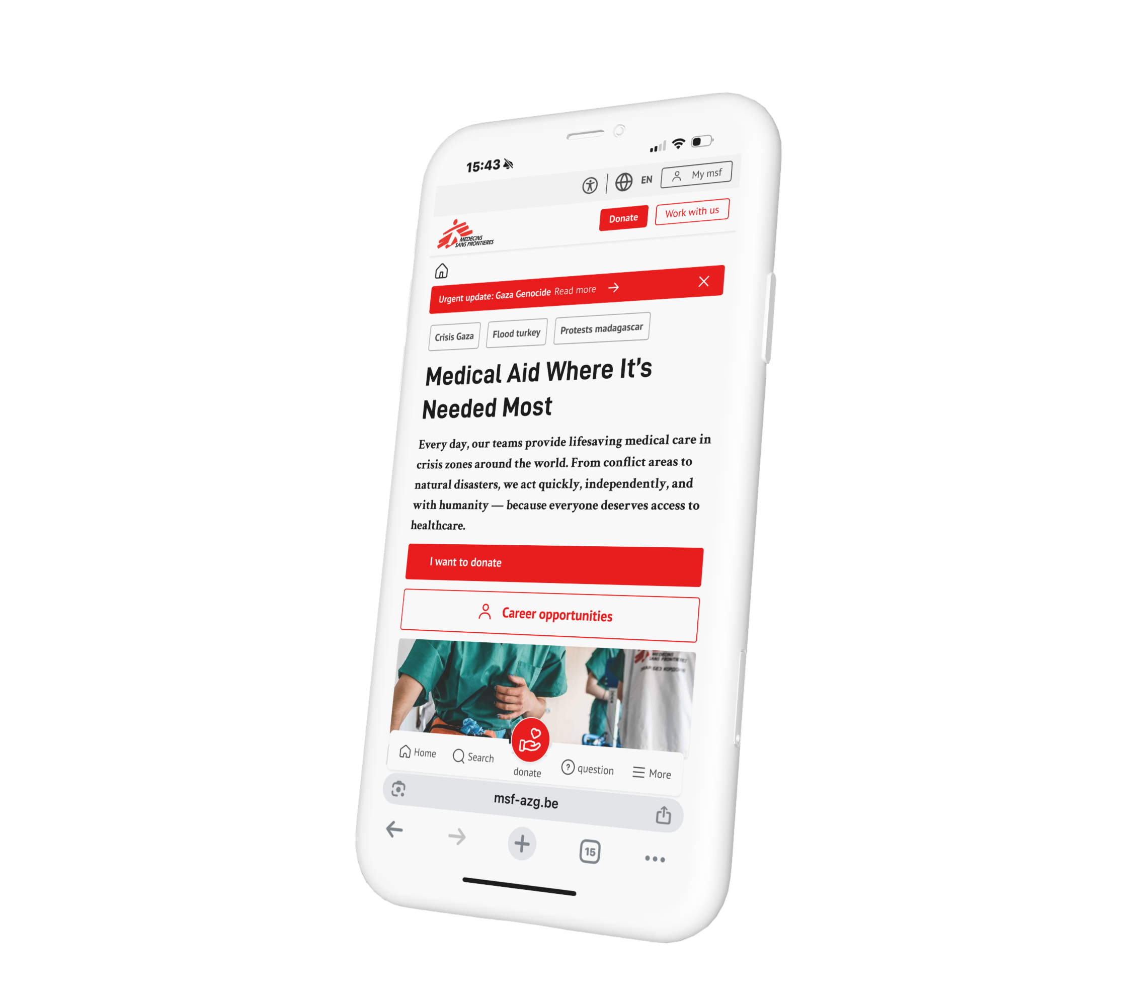
Project snapshots
A few examples from the project showing how structure, components and accessibility thinking came together across the website.
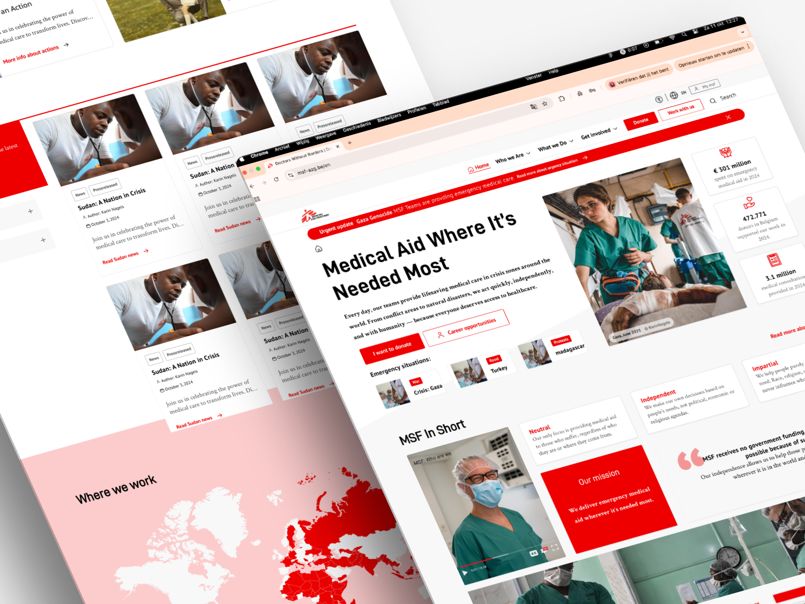
💡 Accessibility becomes much more efficient when it is solved at component level rather than page by page.
Why structure mattered so much
Accessibility is closely tied to structure. When content hierarchy, layout logic and navigation patterns are unclear, usability suffers for everyone — not only users with disabilities.
By improving structure, we helped make the website easier to navigate, easier to scan and easier to maintain over time. This is especially important for content-heavy environments where many stakeholders need to build or update pages consistently.
What this improved
The result of this work was not a superficial “accessible layer”, but stronger digital foundations. The improvements supported both external usability and internal sustainability.
- Better basis for accessible page creation
- More consistent reusable components
- Stronger alignment between design and development
- Improved clarity for stakeholders working with the system
- A more future-proof approach to accessibility
This is exactly where we see the most value in accessibility work: not only fixing barriers, but creating better digital systems from the ground up.
What we learned from the project
One of the biggest lessons from this project is that accessibility and UX cannot really be separated. The most effective improvements often come from solving deeper structural issues — not only technical defects.
It also reinforced something we see often: when accessibility is integrated into components, templates and workflows, teams are in a much stronger position than when it is left to the end.
🛠 Need support on a similar project?
We help teams improve accessibility, structure and usability in a way that works in real-world design and development processes.
Talk to JuwixWhat to do next
If your website is growing in complexity, accessibility should not be treated as a last-minute fix. A better starting point is to assess where your structure, components and flows are creating friction today.
- Audit your key templates — not only single pages
- Review reusable components — that is where accessibility scales
- Improve structure first — clearer hierarchy often solves multiple issues at once
- Align design and development — accessibility should live in both
- Build for long-term maintainability — not only short-term compliance
Juwix helps organisations create accessible digital systems that are clear, practical and built to last. Get in touch for a free intro call — we’ll help you identify the most effective next steps.