The project context
Before this project, Decathlon's material engineers worked with large, automated Excel sheets to compare and match metals — a process that was time-consuming, inconsistent, and hard to scale.
Our task was to design the first version of an internal tool that could centralise this data and make comparison effortless. The goal was not just to digitise data, but to make it usable.
🎯 The goal was not just to digitise data — but to make it usable.
The challenge
Working with technical data at this level of complexity comes with a specific design challenge: how do you balance depth with clarity? The engineers needed access to rich, detailed information — but the interface had to feel simple and purposeful, not like a database export.
The existing Excel-based workflow had grown organically over time. It worked — but it was fragile, hard to onboard, and increasingly difficult to maintain as the material catalogue grew.
What the old workflow made hard
- Comparing materials required navigating multiple spreadsheet tabs manually
- Data was inconsistently structured, making automation unreliable
- Onboarding new engineers was slow — the system only made sense to those who built it
- Scaling the material catalogue meant more formulas, more fragility
Our role in the project
- Mapping existing workflows and identifying friction points across the engineering process
- Designing the information architecture and interface for the internal tool
- Running iterative prototyping cycles with real engineers as test users
- Translating complex filtering and comparison logic into clear, usable interface patterns
Our approach
We started by understanding how engineers actually worked — not how they were supposed to work. Through workflow mapping, we identified the real friction points and the mental models people used when comparing materials.
From there, we translated those insights into clear interface patterns. Each feature — from filtering to material comparison — was designed to match the way engineers actually think and work, not just what the data technically required.
💡 Designing clarity into complexity — strong information architecture combined with consistent visual structure turns technical depth into something navigable.
What we did
Through iterative prototyping and usability testing, we transformed scattered spreadsheets into a structured, intuitive platform that supports engineers in making faster, more informed material decisions.
- Workflow mapping — documented the existing Excel-based process and identified where time was being lost
- Information architecture — structured the material catalogue in a way that supports comparison, filtering and future scaling
- Interface design — designed a clear, purpose-built UI that makes complex datasets feel manageable
- Iterative prototyping — tested and refined each feature through multiple cycles with real engineers
- Usability testing — ensured every interaction matched how engineers actually think and work, not just what was technically possible
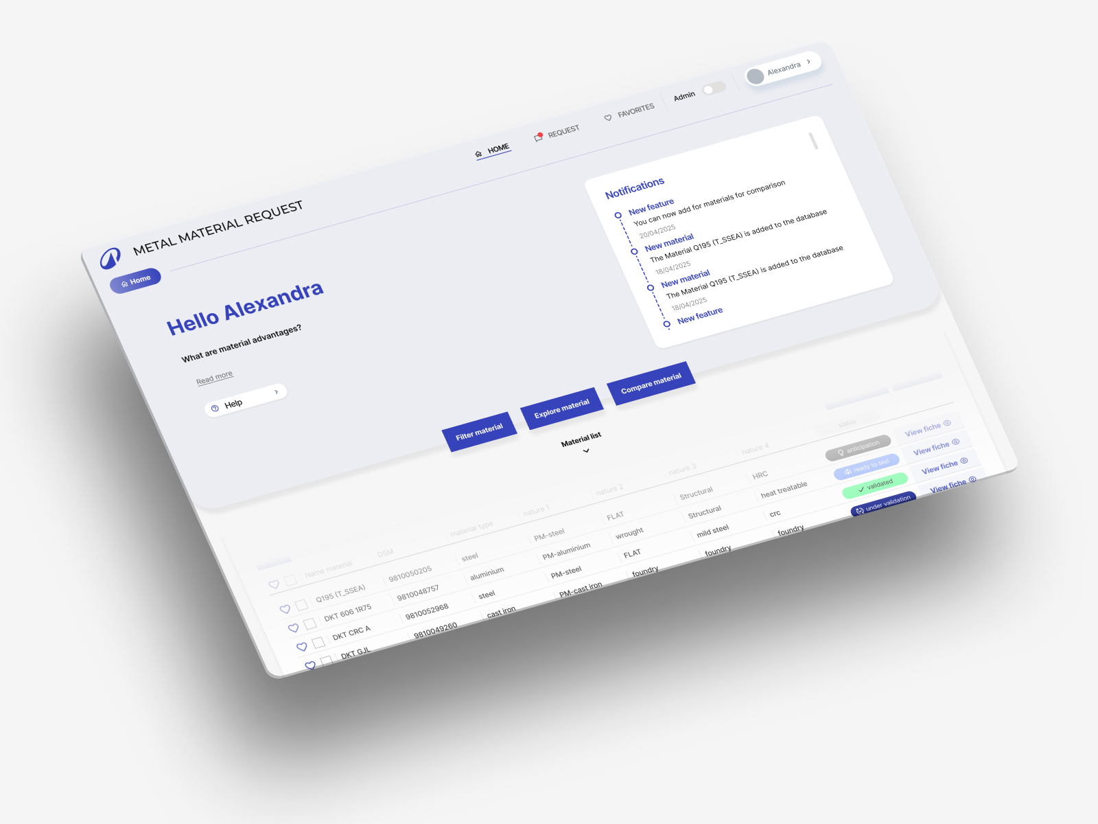
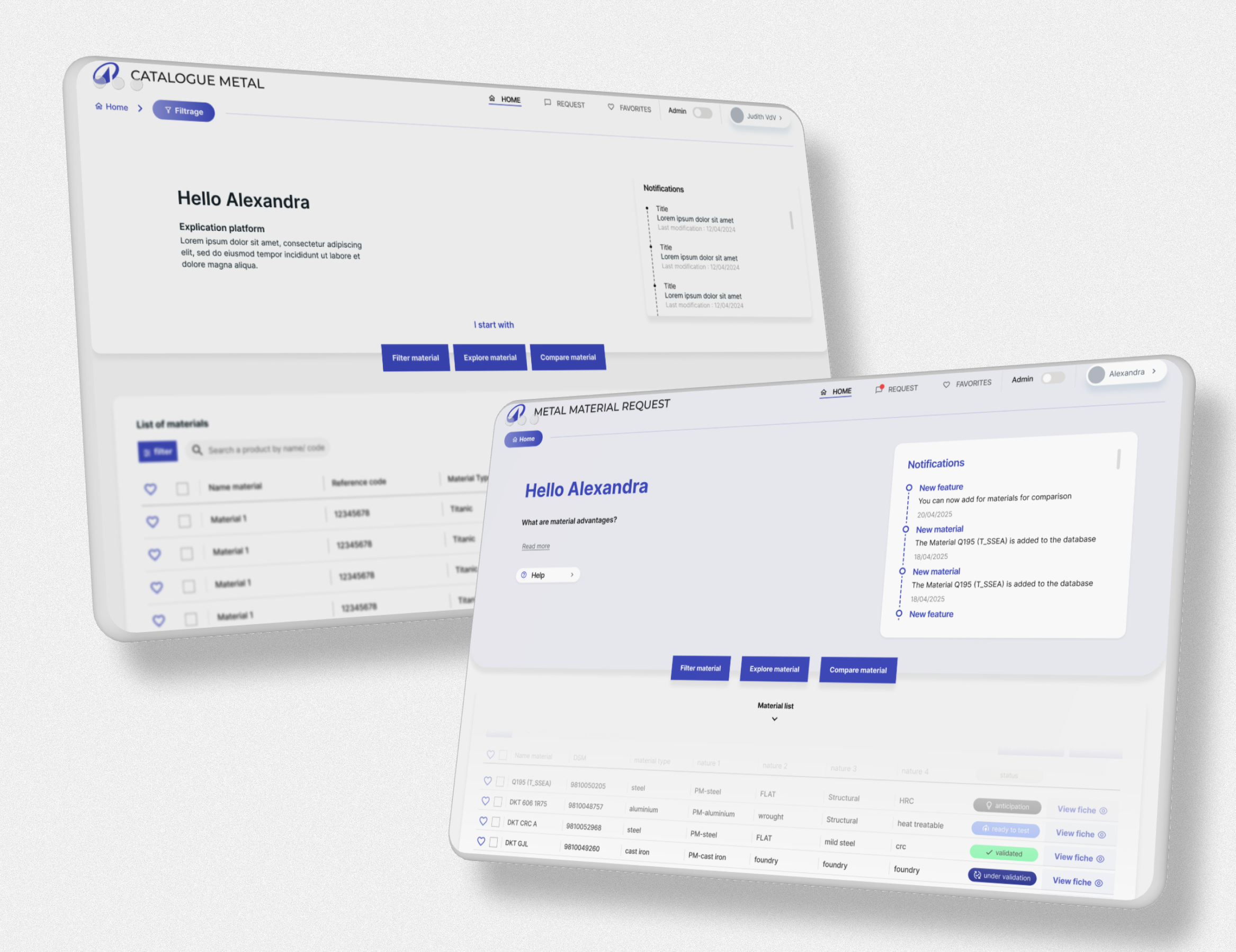
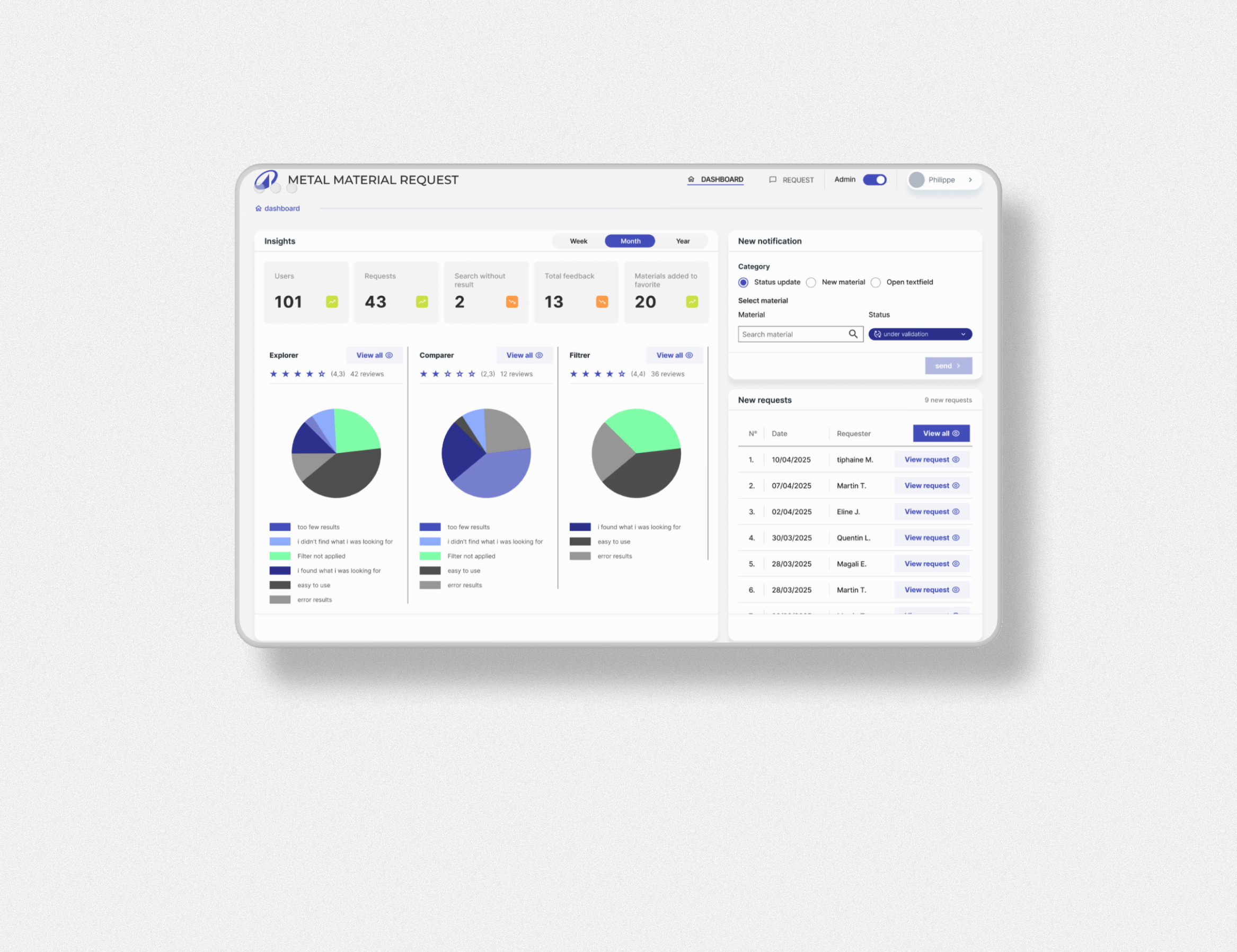
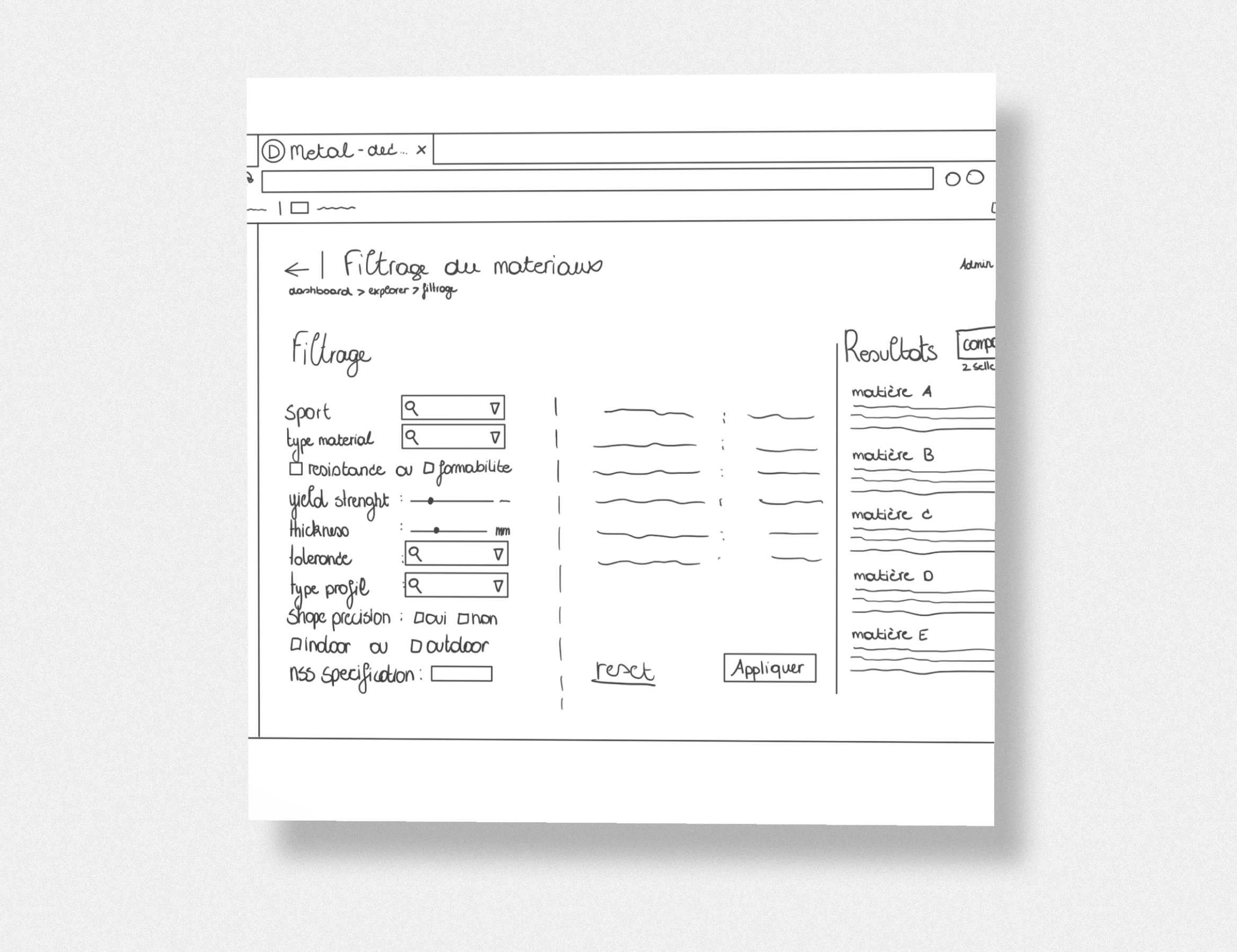
Project snapshots
A few screens from the Decathlon Metal tool — showing how we turned complex material data into a structured, navigable interface.

The result
The platform now turns complex datasets into clear, actionable insights. It feels light, reliable, and purpose-built — proof that good UX can replace hundreds of hidden Excel formulas.
- Engineers can compare and filter materials in a fraction of the time the old process required
- The structured platform is scalable — adding new materials no longer means adding more fragile formulas
- Onboarding new engineers is faster, because the system is self-explanatory by design
- The tool supports faster, more informed decision-making — without sacrificing technical depth
What we learned
This project confirmed something we come back to again and again: the hardest UX problems are rarely about adding more features. They're about finding the right structure. When you get the information architecture right, complexity becomes navigable — and a tool that used to require deep institutional knowledge starts to feel obvious.
Working closely with real engineers throughout the process was also essential. The best interface decisions came out of testing, not assumptions.
🛠 Got a complex internal tool or data-heavy product?
We help teams turn complex workflows into intuitive, scalable digital products — built around how people actually work.
Talk to JuwixWhat to do next
If you're sitting on a workflow that lives in spreadsheets — or an internal tool that only makes sense to the people who built it — the best first step is mapping how people actually use it today.
- Start with workflow mapping — understand the real process before designing anything
- Test early, test often — assumptions about how experts use tools are almost always wrong
- Design for the mental model, not the data model — structure the interface around how people think, not how the database is organised
- Plan for scale — the best internal tools grow with the organisation, not against it
Get in touch for a free intro call — we'll help you find the right starting point for your product.